How to Design a Coastal — Not Kitschy — Beach House

LISA CREGAN: This was the late Albert Hadley's vacation cottage, wasn't it? What was it like being asked to redo the home of a legend?
TODD ROMANO: A longtime client called to tell me she'd just purchased ahouse in Naples and said, "Actually, I think it was once owned by a friend of yours." I thought, Oh my God, she bought Albert's house! He'd furnished it so sparingly — a wicker chair here, a bust on a pedestal there — it was incredibly simple. But it was gorgeous. House Beautiful published it in 2000. Now it's a winter getaway for an independent woman with grown children and grandchildren. My job was to figure out how to accommodate a family here.
And you somehow did it without forsaking any of Mr. Hadley's elegance.
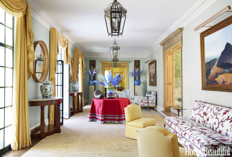
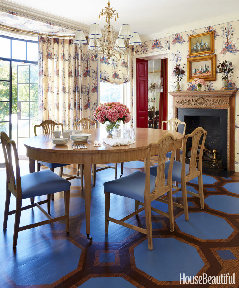
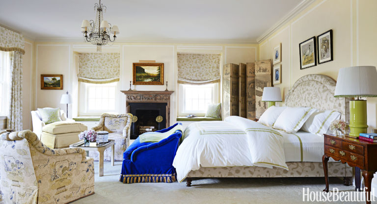
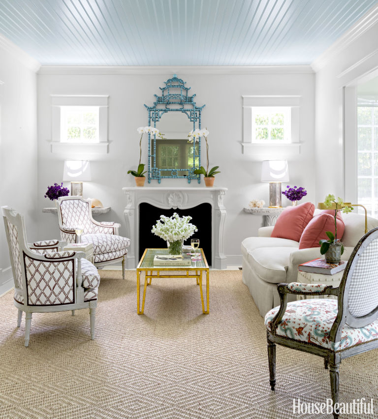
This house is a great example of how you can use sophisticated French furniture in a casual setting. It doesn't have to be all rattan and vinyl just because it's Florida! Gilded furniture would, admittedly, be ridiculous here, so even though some of these pieces are antique, they aren't FFF — Fine French Furniture. They're either painted or distressed, and we did practical things, like covering the Louis XVI chairs on the front porch in coral Ultrasuede. In the dining room, the chairs are in a turquoise zebra print — a perfect fit for Florida, just like the lattice fabric on the living room's antique bergères. Then I threw it all down on straw carpets and used simple white-painted matchstick window shades.
Have you always been a Francophile?
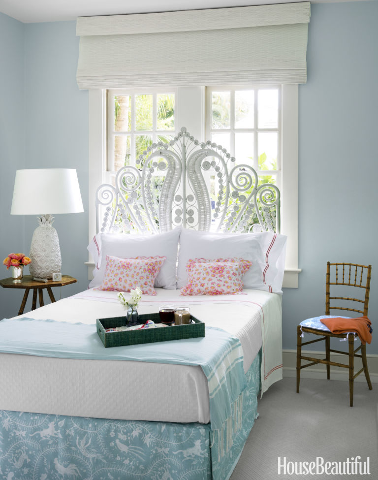
Oh yes. But I'm also a Tex-ophile, because I studied architecture at the University of Texas, and I'm definitely a Georgian-ophile — the list goes on and on. I'm very inclusive! I love the living room's faux-bamboo mirror, the quirky palm-frond consoles with their coral limestone tops, and the guest room's loopy wicker headboard. Those things are just as pleasing to my eye as a carved French chair.
Juggling so many love affairs must be complicated.
Ah, that's the trick. People think decorating is about picking out pretty things and scattering them around, but it's the floor plan that's paramount. I'm obsessed with traffic flow. For example, you have to walk through the living room to get to the dining room, so I used bergères on one side of the fireplace — instead of another sofa — because chairs are easier to navigate. Next, I lay out color and pattern within the plan. The print on the seat of the living room fauteuil is the linchpin because you see every single color in the house: off-white, brown, coral, turquoise. It's an extremely charming French print — very playful, like this whole house.
A turquoise front porch certainly makes for a lighthearted welcome.
I love mint green when there's this much dark, tropical greenery outside the windows — it lightens the mood. I'm known for colorful rooms, and I'm not afraid of strong color, but too often people will do a blue room and a red room, and the house ends up looking like a gumball machine. There's a consistency to color here. In the main living areas, the walls are off-white, so the rooms read easy and open; the big pops of color happen on the furniture. We painted the living room ceiling blue to subtly highlight the original beadboarding and to reference the sky. And all the floors are painted a very pale gray. So there are bright walls on the front porch, then colors get calmer until you go all the way back to the guest room, where aqua walls harmonize with the bed skirt.
You've brought such majesty to tiny rooms with low ceilings.
I worked hard to create strong verticals and avoid the horizontal. The pagoda mirror over the living room fireplace goes up to the ceiling, and so does the mirror in the dining room. I adore large mirrors because they add scale to a room. I also kept the furniture low-slung, so the rooms seem taller.
Did you feel Hadley guiding your hand?
I had Albert on my shoulder the whole time. He was one of the great teachers for a generation of decorators. His mantra is my mantra: Good design is editing. I always want to strip down rooms to their most beautiful essence. I hope that's what I've done here.
Taken from http://www.housebeautiful.com/

Luxury Homes Taking Different Approaches To Artwork

An art collection is expressive and personal all at once. Art reflects the background of the owner, gives a voice to their dreams and desires, and it serves as a strong anchor around which all other design elements can rally. There's no right or wrong way to display interior artwork and each of the luxurious homes featured in this post take a different approach. The first interior uses a few solid statement pieces to express a personal style, while the second home uses sculptural pieces to emphasize its subtle geometric theme. The last home keeps things simple in public spaces but employs fabulous full-wall artwork in the bedrooms.

How to Elegantly (and Effortlessly) Combine Colors

MIMI READ: A house this imposing could have easily ended up seeming grandiose. Instead you've made it so enchantingly chic and warm. What inspired you?
CHRISTOPHER MAYA: The house itself. It's a fantastic 1930s Georgian, quite large and gracious. It sits on 26 acres in Locust Valley, an affluent suburb on Long Island that's been a gold coast for 100 years. We gutted it completely, but its proportions were always sublime.
Who are your clients?
A Chinese family who had never lived in America before. My goal was to create a traditional, English-inspired American home that feels relevant for today.
It's decorated to the nines. You've also suffused it with a subtle Chinese feeling. Did you choose the foyer's scenic wallpaper for its chinoiserie aspect?
It does evoke a Chinese flower-and-bird painting. But I picked it because it is so pretty and has many little stories in it. I love the color — spring green with an acid bite. It adds a sophisticated whimsy to the walls, which ascend to the upstairs landing. But the hero of this space is really the staircase. Its sculptural beauty needed a smashing backdrop.
Except for some intentional brown wood moments, you've used a bright palette throughout.
I like to feel happy when I walk into a house. Vivid color, if it's used carefully, accomplishes that instantly. My clients don't wear bright colors and didn't initially profess a love for them, so I was a bit worried at the beginning. But when I began mapping out a yellow living room and upholstering the dining-room doors in leather the color of Diana Vreeland's lipstick, I could see them responding positively. Then I realized that a lot of bright colors are used in China, especially reds and yellows.
As I understand it, in Chinese culture, red symbolizes joy, and yellow is regarded as the most beautiful color. The gallery certainly celebrates joy and beauty.
This is the main artery of the house. It's luxurious to have a pass-through space that accommodates two seating groups, big flower arrangements, and sculpture. I did a jazzy red center table and made yellow Regency-style curtains with swags and jabots; we rarely do such formal treatments anymore. But they needed a foil. So my painter stripped the door casings down to bare wood. It gives everything a fresh feel.
You left the paneling unpainted in the library, too. It's naked and glowing.
The pine was hidden under layers of paint, some of which had seeped into the wood. It took a skilled decorative painter and his arsenal of secret chemicals to create the effect of wood that had aged over time  — not easy! The knotty pine became a wonderful backdrop. I had the inside of two bookcases painted in red lacquer and the shelves edged in stamped leather. The other bookcases were lined in the same marbleized paper used in old leather-bound books.
What do you call the template painted on the breakfast room floors?
It's an octagonal honeycomb pattern — classic, but the scale is fun. Because of the charming shape the bow window gives this room, I wanted a cozy, playful ambience. I had the doors stripped to their original metal finish. I designed a whimsical version of a Tree of Life fabric for the curtains and walls — if you look closely, it has a Dr. Seuss vibe.
ADVERTISEMENT - CONTINUE READING BELOW
You've put a great deal of furniture in the master bedroom, yet it doesn't feel crowded. And that cobalt sofa — what a crazy decision! — makes the room.
The master bedroom is big. I was able to create a furniture plan so my clients can chat, read, listen to music, or sit with their kids — they can shut out the world if they want to. The walls needed some architectural interest, so I treated them with French faux paneling painted in three tones of yellow. I used fabrics and colors that are soft and a bit faded. When things seemed to be getting too sleepy, I added bolts of blue and chartreuse.
This house is full of serious antiques and many marvelous reproductions and adaptations designed by you. Where did you learn so much about fine furniture?
I studied interior design at Parsons. But I've been looking at furniture for a long time. My mother was a history buff and an artist. She collected Sheraton and Regency pieces. My aunt was an interior designer. As a child, I used to go with the two of them on lots of house tours.
Did you design anything as a kid?
In sixth grade, I built an elaborate tree fort with canvas Roman shades and a widow's walk. My sister had a dinner party in it. It was just one of those things you did and never thought twice about. Today, of course, a parent would have it professionally photographed and make sure it was in the college essay.
Taken from http://www.housebeautiful.com/